Painting kitchen cabinets is a labour-intensive task. What if, after taking all those precautions to paint your cabinets, you still don’t like the colour? What if you regretted choosing a cream white rather than a purer white? Here we will help you in choosing the most suitable cabinet colors for your kitchen.
If you cook often, dark wood cabinets are a perfect choice. They can be warm and inviting and pair well with many flooring and countertop combinations. You can choose a neutral or gray colour for your cabinets if you rarely cook. Whether you prefer neutrals, grays, or a more subtle look, you will find the perfect colour for your kitchen. Here are some of our favourite choices for kitchen cabinets. Read on to decide which one is best for you!

Best Color for Cabinet in the Kitchen
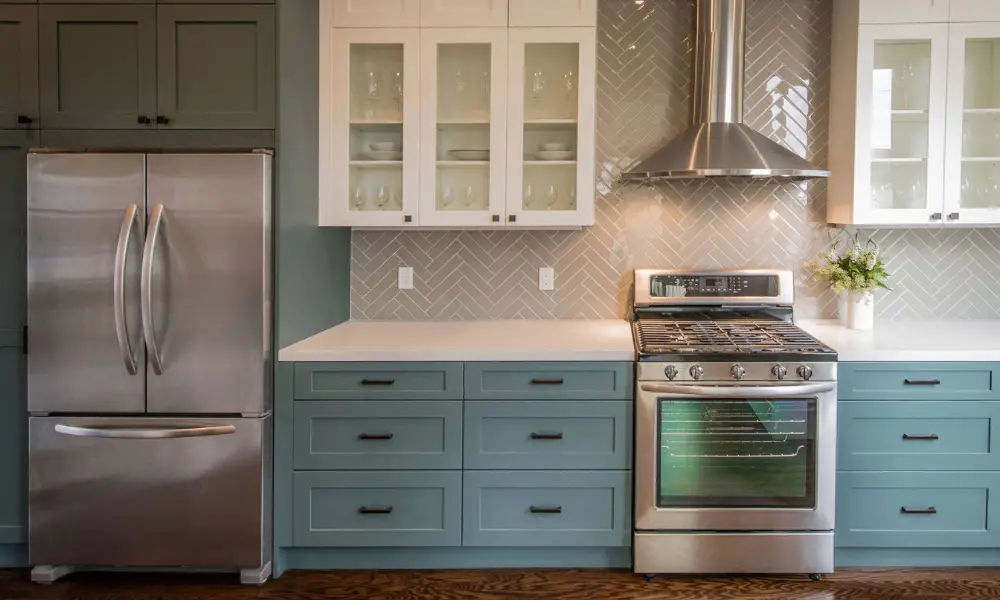
Dark grey and white
Before choosing paint colours, it’s crucial to consider how much natural light your room receives. My favourite colours in a kitchen are white and a deep, rich grey. In a recent kitchen makeover, we utilized Farrow & Ball Down Pipe on the lower cabinets and Benjamin Moore Decorator’s White on the upper cabinets. While white on the upper cabinets and walls kept the area open and airy, the dark grey anchored the design and the satin brass hardware we picked popped against it. For both, we selected a matte surface that was yet wipeable for a more modern take. Additionally, stainless steel complements both of these hues wonderfully.
Clear white
“Chantilly Lace by Benjamin Moore is a lovely, crisp white that looks well in any kitchen. It enables other design components, like the blue stove in the above kitchen or a cozy wood island, to stand out as focal points. It always turns out beautifully in the homes where we’ve utilized it.
Subtle Grey
“I never get tired of bright, white environments in kitchens. It’s a timeless style that makes your furnishings (and food, of course!) the star of the space. I adore using Farrow & Ball’s Cornforth White in their Estate Eggshell finish for the cabinetry to create a subtle contrast to bold white walls. It’s a light, airy colour that reads as cloud-gray and gives a room just the right amount of depth.
Vibrant Blue
“We tend to like darker blues when we want to create a bit of strong contrast. Hale Navy by Benjamin Moore provides the kitchen in the photo above with a lot of depth and warmth. One of our favourite design combinations is the classic blue, which also makes a statement.
Dark grey and white
“I like to add a dark grey, like Benjamin Moore Gray, to the cabinets to lend a touch of elegance to bright white kitchens (my faves are Farrow and Ball All White and Benjamin Moore Decorators White — all are cheerful and welcoming). It makes the ideal mix. These hues complement a natural stone (like marble) and a quartz counter and go with any finish (stainless steel, brass, bronze, etc.).
A pale shade of white.
“We adore painting kitchens, White Heron, by Benjamin Moore. Without any strange undertones, it is a lovely, bright white. The colour has a light, airy quality. Because it is so neutral and adaptable, we adore how it complements Carrara and Calcatta marbles and coloured counters and tiles. We often use a semi-gloss finish on cabinets and trim unless we desire a higher gloss or a hand-painted look.
Greige
“Usually, choosing the incorrect undertone is to blame when a paint colour fails. There are various shades of grey, such as blue, green, purple, and others. The ideal greige is Benjamin Moore’s Balboa Mist (a mix of beige and grey). Balboa Mist, I’ve discovered, can assist tone down existing tile when dealing with it, giving it a more cool, neutral appearance. It is the ideal hue to go with so many different things.
What to select: Light or Dark Kitchen Cabinets?
Regardless of what’s popular right now, the decision between light and dark kitchen cabinets truly boils down to personal preferences in modern kitchen design. When selecting the colour scheme for your cabinets, there are a few factors to remember. After all, that’s the one feature that will truly define the room’s atmosphere, and you’ll need to be content with it for a very long time.
The following considerations should be made while deciding between light and dark kitchen cabinetry.
- While dark tones might give the kitchen an edgier and more dramatic appearance, light cabinets typically give the room an airy, clean feeling.
- A pale shade of white.
- “We adore painting kitchens, White Heron, by Benjamin Moore. Without any strange undertones, it is a lovely, bright white. The colour has a light, airy quality. Because it is so neutral and adaptable, we adore how it complements Carrara and Calcatta marbles and coloured counters and tiles. We often use a semi-gloss finish on cabinets and trim unless we desire a higher gloss or a hand-painted look.
- Lighter kitchens are seen to be more enduring. However, after a while, both extremes (such as an all-white, all-black, or all-gray) can become boring. Because wood brings warmth to the room, its texture offers visual variety, and it is a choice that never really goes out of style; combining those tones with some wood cabinetry is preferable even if you desire a largely light or dark palette and like the look of lacquer. You might pair white with cinnamon walnut, light oak, or elm wood, for instance, and grey cabinets with smoked, coal, or coffee elm.
- Make sure you are prepared to deal with it because lighter cabinets—especially white cabinetry—will reveal stains and wear and tear more readily.
- These days, traditional, opulent homes are frequently linked with dark kitchens.
- Lighter cabinetry allows you to apply other colours as accessories without producing an overpowering appearance.
How to Make Small Kitchen Look Larger?
Use light colours.
Although white kitchens are currently very popular, they have more advantages than being attractive. Since light colours reflect more light than dark colours, they will give the impression that your kitchen is bigger and airier. Other wonderful colours to make your area appear bigger than life include light blues, greens, or pastel yellows.
Put Lines in Place
Depending on the arrangement, lines will spread your area horizontally or vertically. You can make lines with your flooring, tiling, cabinets, or decor. Vertically oriented cabinetry, like the island seen below, can draw the eye upward and give the impression that your kitchen is taller. As a result of the subway tile lines, the kitchen will appear longer and higher.
Put Reflective Materials to Use
Mirrors and other reflective surfaces are frequently used in restrooms, living rooms, and corridors since it is well known that they make a room appear larger. Apply the same way of thinking to your kitchen.
Cabinetry with glass panels will increase the visual area.
Your kitchen will appear larger thanks to the unhindered visual paths created by glass-panelled cabinetry. You can also use it to display your prized possessions and favourite dishes! You may even add clear chairs or glass pendant lights to your decor if you can’t update your cabinetry.
The Best Way to Make your Kitchen Appear More Expensive
Magic Marble
Marble is a material that everyone wants in their kitchen, and it exudes elegance and wealth. You may make a tremendous impact in your kitchen simply by introducing a few subtle marble accents rather than removing all your countertops and replacing them. A tiny baking area can be made in your kitchen using pre-cut marble. Use marble tiles to repurpose a floor section or create an eye-catching backsplash. More inexpensive ways to use marble can be found here if you’re interested. A modest amount of marble may add visual interest to your kitchen design because it blends well with most colour schemes.
Opulent Lighting
Even though most of the time, people tend to gaze up to the ceiling first when they enter a space, lights can sometimes be the aspect of the kitchen design that is most neglected. Use low-hanging fixtures, especially above kitchen islands and dining areas, to create the appearance of a higher ceiling. If you want something cheap that improves most sorts of décor, globe fixtures are a simple choice. Another less expensive option to make your kitchen appear expensive is to install a dimmer. Lighting can be dimmed to create a posh ambience during supper.
Serious Serving
The dishes you use to serve meals and beverages significantly impact how expensive your kitchen is. Purchase new bowls, plates, cups, and glasses. Particularly stemware has the power to leave an impression. Use new stemware to your advantage; it doesn’t have to be pricey to seem expensive. Your kitchen can look much more opulent and inviting by placing your stemware in a glass cabinet, on an open cabinet, or in a cabinet with a glass door.
Expensive Colours
A new coat of paint may completely change your kitchen. Beiges and creams may make a kitchen appear luxurious and pricey. If your kitchen is contemporary, dark hues like black and grey can make it appear opulent and luxurious. Add some wood and metallic accents to balance off the white, which reflects light and enlarges the room. If you don’t want to paint your complete kitchen, painting the cabinets will still make a significant difference. Your kitchen can gain value by adding a feature wall, which you can paint yourself or cover with textured wallpaper.
How do you Properly Match Cabinets with Trim?
Simply continuing with the same colour for your cabinet surfaces and trim is the simplest way to match cabinets and trim. Most people who subscribe to this school of thinking also think that any kitchen moulding should be finished in the same shade as the cabinets and trim.
There are only two ways to “match” cabinets and trim without doing so in reality.
Utilizing complementing hues comes first.
Use contrasting hues as your second strategy.
The simplest place to start is to look at a colour wheel to see what alternatives you have based on the finish you’ve picked for your cabinets. When using complementary and contrasting colours, there are some guidelines to follow.
Any contrast you purposefully introduce need not be a striking contrast. To avoid contrasting appear unintentional, it’s crucial to try to evoke a sense of coherence among the various parts being connected.
You can easily balance cold and warm colours by using a colour wheel. Remember that different colours can alter the “moods” of a space.
For instance, warm hues like reds and yellows are vibrant, dynamic colours that lend a space a feeling of high energy. A room feels serene when painted in cool colours like white and green.
The ultimate objective is to ensure that when someone enters a kitchen, they don’t immediately notice the trim.
People shouldn’t notice the trim because it should blend in so well with the cabinets.
Instead of highlighting separate components, a kitchen achieves true harmony when all components work together to form a “place.”
Conclusion
Your kitchen cabinets can easily and affordably be updated with a fresh coat of paint. These popular kitchen cabinet colours inspire you whether you prefer a clean, neutral style or vibrant, eye-catching hues. For inspiration, while updating your kitchen, refer to these popular cabinet paint colours.